



7:49 PM

File
Edit
View
Go
Help
Pocket Adventures
Explore your city in gamified journeys.
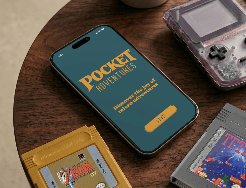
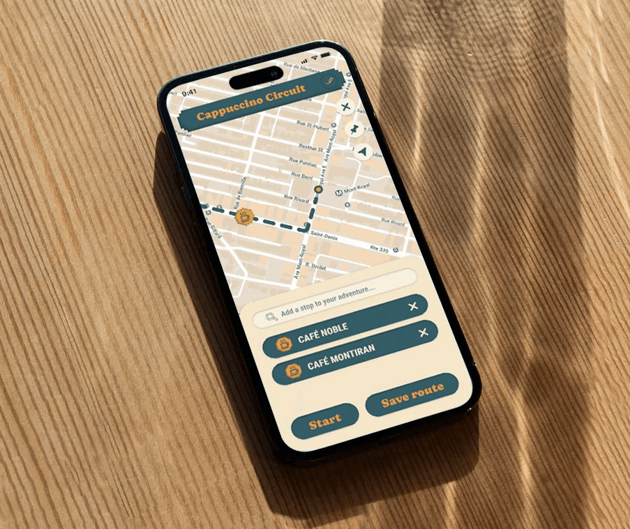
PROJECT OVERVIEW — Pocket Adventures turns everyday city streets into playful journeys. Using a retro race-track interface, users follow curated or community-created routes, stopping at landmarks and hidden spots to complete short, rewarding micro-adventures.
Reframing how users experience their city.
THE PROBLEM — People want to explore their city but stick to familiar routes. Planning feels like effort, and existing tools inform rather than engage, making discovery feel like a chore instead of an experience.
THE SOLUTION — Pocket Adventures replaces friction with play. A gamified map guides users through city routes with checkpoints, prompts, and small rewards, turning everyday movement into an intuitive and engaging experience.
Making discovery both accessible and rewarding.
BUSINESS IMPACT — The design encourages spontaneous exploration, increases engagement with local environments, and makes navigation feel rewarding rather than routine.
WHAT I LEARNED — Experience drives engagement. Users respond to meaningful journeys first, with gamification enhancing the interaction. Clarity and simplicity are key to making exploration feel effortless.
Simplifying the exploration process.


Like what you see? Contact me!
robrod.world@gmail.com
404 object(s)
Process
Validating the Problem
The Assumption: People want to find new spots in their city, but default to the same routines because planning takes too much effort. Map apps feel like utilities, not adventures.
The Research: I surveyed 15 young professionals about their weekend navigation habits and conducted 5 follow-up interviews.
The Insights:
Utility over discovery: Map tools are treated purely as transactional navigation rather than exploratory tools.

of users reported using map applications strictly for A-to-B utility.
Quote from a user: "I want to wander, but looking up places on my phone pulls me out of the moment. It feels like I'm managing a checklist."
The Goal: Build an interface that replaces the friction of a "to-do list" with the spontaneity of play.
Breaking the Rules
The Challenge: Standard iOS and Android UI patterns (like bottom tab bars) instantly signal to the brain that an app is a tool. I needed Pocket Adventures to feel more playful.
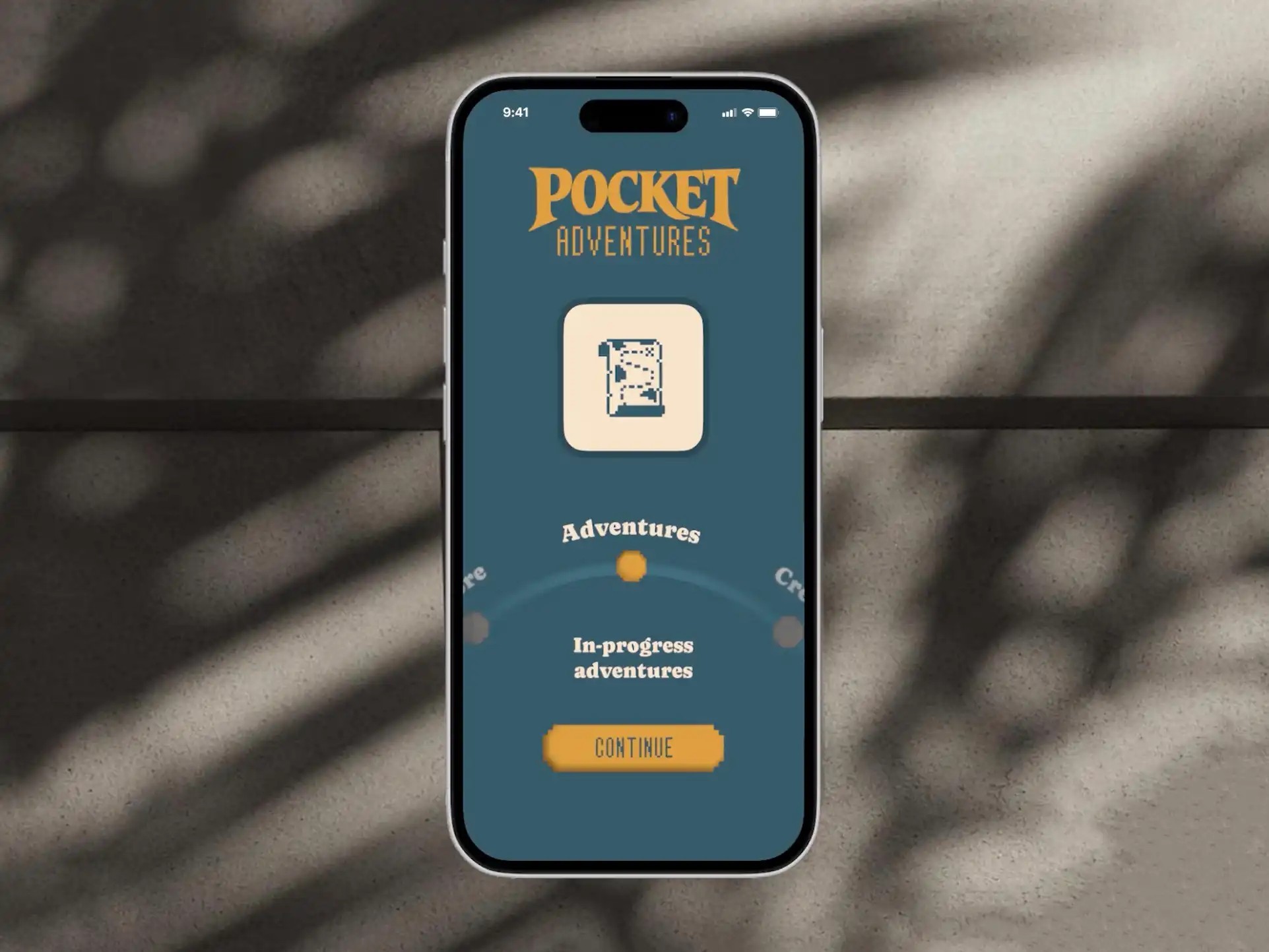
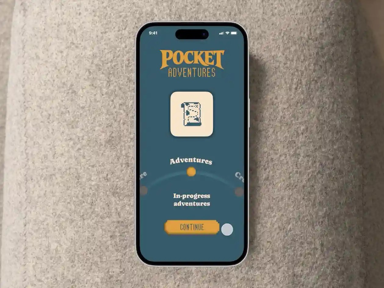
The Solution: I completely discarded standard navigation in favor of a semi-circular dial interface.
The Rationale: Functionally, the dial operates like a menu, but psychologically, it mimics a physical compass or an analog game controller. By forcing the user to physically "spin" through Explore, Adventures, and Create, the UI immediately establishes a tactile, playful tone before the journey even begins.

Designing the Game Loop
To keep users engaged without overwhelming them, I structured the core experience around classic gaming mechanics and retention loops.
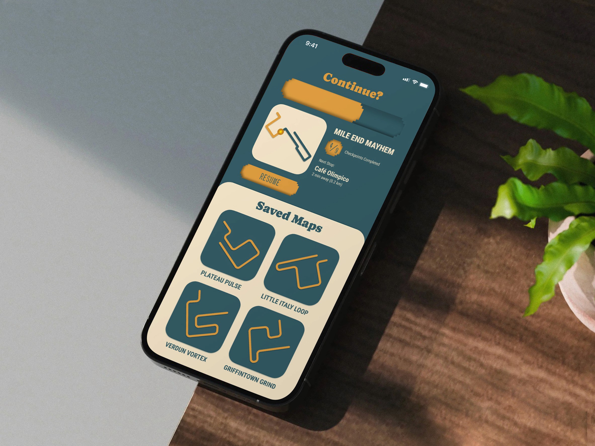
Arcade Urgency: Instead of a static route overview, I designed a "Continue?" screen featuring a countdown bar. Drawing on principles from classic arcade loops, this creates a sense of playful urgency, treating the user like a player trying to maintain a streak rather than a pedestrian following a map.
Local Context: To ensure these mechanics actually worked in the real world, I anchored the digital experience in physical geography. I built and tested high-fidelity, hyper-local routes like the Verdun Vortex and Mile End Mayhem, complete with real stops at places like Café Olimpico and Kem Coba.

Testing & Iteration
The Test: I ran a interrogative evaluation and a localized usability test using the Mile End Mayhem route.
The Tension: The gamified UI was highly engaging, but users still had a fundamental need for practical orientation. They needed to know how much time a micro-adventure would actually demand.
The Pivot: I had to balance the mystery of the game with the reality of walking. In my final iterations, I integrated a dual Map/List view. The Map view keeps the visual focus on the immediate path and waypoints, while the List view explicitly defines the walking time between stops (e.g., 2 min, 10 min, 18 min). This ensures the app remains a reliable guide without losing its sense of adventure.

Process
Validating the Problem
The Assumption: People want to find new spots in their city, but default to the same routines because planning takes too much effort. Map apps feel like utilities, not adventures.
The Research: I surveyed 15 young professionals about their weekend navigation habits and conducted 5 follow-up interviews.
The Insights:
Utility over discovery: Map tools are treated purely as transactional navigation rather than exploratory tools.
of users reported using map applications strictly for A-to-B utility.
Quote from a user: "I want to wander, but looking up places on my phone pulls me out of the moment. It feels like I'm managing a checklist."
The Goal: Build an interface that replaces the friction of a "to-do list" with the spontaneity of play.
Breaking the Rules
The Challenge: Standard iOS and Android UI patterns (like bottom tab bars) instantly signal to the brain that an app is a tool. I needed Pocket Adventures to feel more playful.
The Solution: I completely discarded standard navigation in favor of a semi-circular dial interface.
The Rationale: Functionally, the dial operates like a menu, but psychologically, it mimics a physical compass or an analog game controller. By forcing the user to physically "spin" through Explore, Adventures, and Create, the UI immediately establishes a tactile, playful tone before the journey even begins.
Designing the Game Loop
To keep users engaged without overwhelming them, I structured the core experience around classic gaming mechanics and retention loops.
Arcade Urgency: Instead of a static route overview, I designed a "Continue?" screen featuring a countdown bar. Drawing on principles from classic arcade loops, this creates a sense of playful urgency, treating the user like a player trying to maintain a streak rather than a pedestrian following a map.
Local Context: To ensure these mechanics actually worked in the real world, I anchored the digital experience in physical geography. I built and tested high-fidelity, hyper-local routes like the Verdun Vortex and Mile End Mayhem, complete with real stops at places like Café Olimpico and Kem Coba.
Testing & Iteration
The Test: I ran a interrogative evaluation and a localized usability test using the Mile End Mayhem route.
The Tension: The gamified UI was highly engaging, but users still had a fundamental need for practical orientation. They needed to know how much time a micro-adventure would actually demand.
The Pivot: I had to balance the mystery of the game with the reality of walking. In my final iterations, I integrated a dual Map/List view. The Map view keeps the visual focus on the immediate path and waypoints, while the List view explicitly defines the walking time between stops (e.g., 2 min, 10 min, 18 min). This ensures the app remains a reliable guide without losing its sense of adventure.
404 object(s)